University of Minnesota Libraries ReDesign

1 Research
Research Plan
Understanding our user’s pain points and frustrations was the focal point of our research objectives as these elements would create the solutions for our finished design. In addition to immediate frustrations, we sought to dive deeper into user abilities, reasoning, and goals.
To keep the project moving in the right direction we constructed our research plan so we had a clear trajectory.
Research Goals
Gain an understanding of how other universities approach their library webpage design.
Identify our target users.
Learn how current students are utilizing the library homepage.
Uncover user’s experiences on the current version of the library’s pages.
Assumptions
Both undergraduate and graduate students utilize the Library pages on a regular basis.
The Library pages are a necessary resource for UMN students.
Students are using the Library page for more than just research and resources.
Digital resources should be easily accessible and easy to navigate.
Students are less likely to utilize Library services if they are not easily accessible.
A percentage of students will not ask for help if they cannot find what they need.
Methodologies
Secondary Research
‘Market’ Research: Gaining a basic understanding of library usage across college campuses
Competitive Analysis: Exploration of 3 University Library websites and one Public/City Library website. This time is spent learning how other entities are handling UI Design, layout, content, and hierarchy.
Primary Research
User interviews: 5 Students ranging in age from 19-24. Designed to better understand how current students are utilizing the website and further uncovering their pain points and impressions.
Secondary Research
‘Market’ Research
While this was not ‘market research’ in the traditional sense, we did make an effort to gain some general insight into how university students were utilizing their library resources. Having a better understanding of user perspectives would help us address the relationship between content, hierarchy, and user needs. In addition, we created a google survey for students in order to generate some data points and posted that on social media.
In 2019, academic libraries in the United States at post-secondary institutions that grant doctoral degrees had an average weekly attendance of 24,181 visits.
Academic libraries in universities granting Bachelor of Arts degree had only 5,462 weekly visits on average.
In a study done with 27 colleges and universities participating, it is revealed that a majority of students, specifically 73%, use the library less than the Internet.
In an increasing number of students are using the physical library for non-academic related activities such as socializing, napping, or accessing technology such as computers or printers.
Through our own survey we extracted the following data points:
Research was the most important primary use of the libraries website.
The majority of those surveyed said they only used the library website ‘occasionally’ at 36.4%.
66.7% of those surveyed only used the website for general services - such as locating a printer or looking up articles.
Competitor Analysis
To better understand how the UMN Library page stacked up, we did some analysis of other library websites - 3 direct (university) ‘competitors’ and 1 indirect (city). We wanted to see how other institutions utilized elements such as navigation, hierarchy, and imagery to highlight content.
Primary Research
User Interviews
We created a guide to facilitate the interview process with 7 open-ended questions to invite our participants to lend insights into their current library usage.
Some of the important aspects we wanted to better understand were - how do users currently utilize the UMN Libraries website, what their impressions of the current content layout was, what they felt was confusing or difficult to navigate, and what they felt could improve the experience.
User Persona
So who is our user? After putting together all of our data from our interviews, we started to get a clearer picture of who our user was going to be. Let’s meet Jenna, a UMN Freshman studying design.
2 Strategy
How Might We?
We had identified a number of user insights from our interviews that started to create a more clear picture of how we wanted to tackle the design phase. The use of these insights allowed us to put together How Might We statements to address implementing creative solutions.
Storytelling
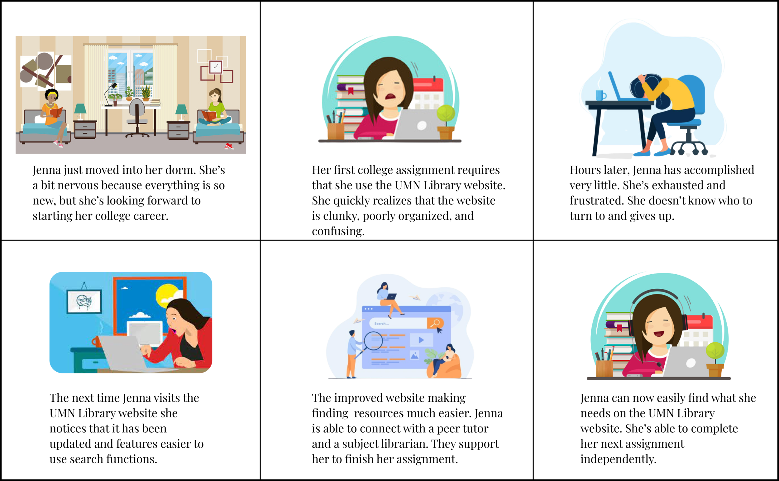
The How Might We questions addressed the most pressing issues our users were facing and would then allow us to implement creative solutions.
I created a storyboard for our user to bring a visual journey to life. I knew who our user was, what she was facing, and what we hoped to accomplish and the storyboard makes her experience a reality.
3 Design
Information Architecture
One of the biggest issues we noticed throughout the library pages was significant redundancy in the content and navigation structure that was not intuitive or user friendly. The first step in the design was creating new information architecture to simplify the navigation and make it easier to use. I reduced the navigation to a header, primary, and footer that will be displayed on each page throughout the site.
Style Tile
I further developed the visuals the design through the style tile. It serves as a synthesizing document of the brand ideas and inspirations gathered, incorporating logo design, color palette, typography, and imagery that guides UI design later.
Wireframes
With all of the research and brainstorming in hand, I set out to create the early wireframes for the layout. I prototyped the early designs to do a round of user testing to identify where the layout was successful and where it failed. This was critical in implementing design change and build toward a final product.
In addition to the layout of the page I also worked toward simplifying the main search bar function as well as the drop down menus in the main navigation.
Usability Testing
Using the early wireframe prototype, we ran our first round of testing to determine what was and was not working in the layout. With the initial feedback, I was able to go back and iterate on the layout and input some of the UI elements create a mid-fidelity wireframe. With the mid-Fi prototype, we were able to do a second round of user testing which take us to the final version of the UI design in the Hi-Fidelity Prototype.
Hi-Fidelity Prototype - The Final Product
Following the second round of user testing with mid-fidelity prototype we had come to a conclusion as to how to approach the final design. I went back in and reformatted the navigation drop down menus into more descriptive cards, added the final imagery to the Research Center page, and as a group we made the final UI changes to the homepage. The end result was a homepage that was cleaner, more user friendly, and above all else created a balance between content and hierarchy.


